Etching pint glasses I - The design
Back in Oxford I had started taking a pint glass in so I didn’t have to use the tiny glasses provided, but these glasses would occasionally be put in the dishwasher by the cleaning staff, then back in the cupboard, and then someone else might use them, leaving me with glasses more suitable for shots. To solve this problem I decided that it would be fun to design my own pint glasses with my name on them. This might not stop someone using the glass if it ended up in the cupboard, but at least I could definitely claim it was mine and take it back.
Before I even started this project, I knew I want to have a transposition shuffle wrapped round the glass. This means a service which etches/prints a design on a small section of the glass isn’t good enough; I wanted the design to go all the way around. A little searching online didn’t find a service which would be able to do this, at least for a small batch, so I decided to try doing it myself. Fortunately, it is pretty easy to etch a glass using a stencil and some etching cream, provided you can make a good stencil. This is a much more common request and there are plenty of places online that will laser cut a stencil. Or at least that was what I thought. This project actually stalled for a few months when the first few places I emailed didn’t respond and I got caught up in applying for postdocs (yes, it has taken me years to write this). (I ended up using the custom painting stencils from Rowing Vinyl and can recommend them.) It is a little difficult to see the etched design, especially when the glass is wet, but the design has transferred really well to the glasses and I’m very happy with the result. It also isn’t particularly expensive and actually etching the glass once you have the design only takes 15-20 minutes, so it’s one of my more sensible projects.
The design
The basic idea behind the design is very simple. In joint work with Carla Groenland, Jamie Radcliffe and Alex Scott (back in 2018!) I’d come up with a transposition shuffle which uses less than \(\binom{n}{2}\) transpositions. If we ignore the (very important) probabilities that are associated with each transposition, a shuffle can be drawn in the same way as a sorting network. Importantly, this makes it essentially a long rectangular grid which fits nicely round a glass and can provide the basis of the design. The maths and the pretty pictures of transposition shuffles existed before I decided to make the pint glasses, so I’m not entirely sure if I found a solution to a problem or a problem to justify the solution.
Transposition shuffles
In the interest of making this post somewhat self-contained, I’ll define a transposition shuffle and briefly describe the problem, but I’ll redirect you to the paper if you want to read more about it. A lazy transposition \((a, b, p)\) is a random permutation which takes the value \((a ~ b)\) with probability \(p\) and is the identity with probability \(1-p\). A transposition shuffle of size \(n\) is a sequence of lazy transpositions whose composition is a uniformly random permutation in \(S_n\). Alternatively, we can consider the following set-up. We have a set of \(n\) lines each holding a labelled counter. A lazy transposition \((a, b, p)\) sits between lines \(a\) and \(b\) and switches the counters on the two lines with probability \(p\), and does nothing with probability \(1-p\). In this setup, a transposition shuffle is a sequence of lazy transpositions such that the counters are in a uniformly random order at the end of the shuffle. This second formulation suggests a convenient way of representing a shuffle pictorially. We start with \(n\) lines and each transposition is represented by a line between the relevant lines. Although we should really include the probabilities somewhere on the diagram since they aren’t always obvious and are very necessary, they would clutter the diagrams and we are going to omit them.
The main question is to determine how many transpositions are needed in a transposition shuffle. This was first mentioned in a paper by Angel and Holroyd in 2018, but the question had been posed by them several times before this and was even posted on Stack Exchange by Joe Fitzsimons back in 2011. There are multiple different constructions which all lead to shuffles using \(\binom{n}{2}\) transpositions, but is it possible to do better? I’d like to say there was a sudden moment of inspiration where we came up with a construction that was better, but the truth is we simply stumbled across a shuffle with some perseverance and a bit of luck. I wrote some simple MATLAB code which checks if there are probabilities we can assign to a given sequence of transpositions to get a shuffle and would often try out ideas I thought might work. Transposition shuffles seem quite similar to sorting networks, so one thing we tried was fitting probabilities to sorting networks but to no avail. It is easy to construct a full transposition shuffle for \(n\) counters from a sequence of of transpositions that shuffles \(k\) counters across \(n\) lines, and any winnings in the partial shuffle are carried over to the full shuffle. It therefore makes sense to also consider looking for partial shuffles since these should have fewer transpositions in general and should be quicker to check. At some point I tried fitting probabilities to a construction of Yao in Bounds on selection networks for finding and sorting the 3 largest values from \(n\) values (known as a 3-selection network). Taking \(n= 6\) and fitting the probabilities gives a way of shuffling 3 counters across 6 lines using only 11 transpositions while we would expect this to take 12 transpositions!

It is not hard to show that any construction beating \(\binom{n}{2}\) transpositions gives us a way to beat \(\binom{m}{2}\) by a constant factor for all \(m \geq n\), so this single example shows that the bound \(\binom{n}{2}\) is wrong for all \(n \geq 6\), but we don’t even know if it is possible to construct shuffles with \(o(n^2)\) transpositions. At one point I thought this might be possible using our construction, but the probabilities between the groups, that I had suitably dubbed “magic probabilities”, quickly became imaginary. Still, this construction can be pushed until you have 7 on each side, and can even be extended to splitting into a group containing 1/3 of the lines and a group containing 2/3 of the lines. I decided to pick two shuffles, one which shuffles 6 counters across 12 lines and one which shuffles 4 counters across 12 lines (see below). I think these showcase the construction pretty well, and more importantly, the complexity looks about right for the design. (The astute reader may notice neither of these are actually transposition shuffles since they don’t shuffle all the counters, but I’m not going to worry about this for the rest of this blog post and I’ll call them transposition shuffles anyway.)


I’d like to end this section by saying we had worked out the minimum and completely solved the problem, but that is very much not the case. The problem is still wide open and I’d be very interested in an answer either way, but I’ll warn you that it can be quite addictive. However, we have beaten the bound, produced a result that at least a few people might find interesting and, most importantly, produced something that looks good wrapped around a pint glass.
The rest of the design
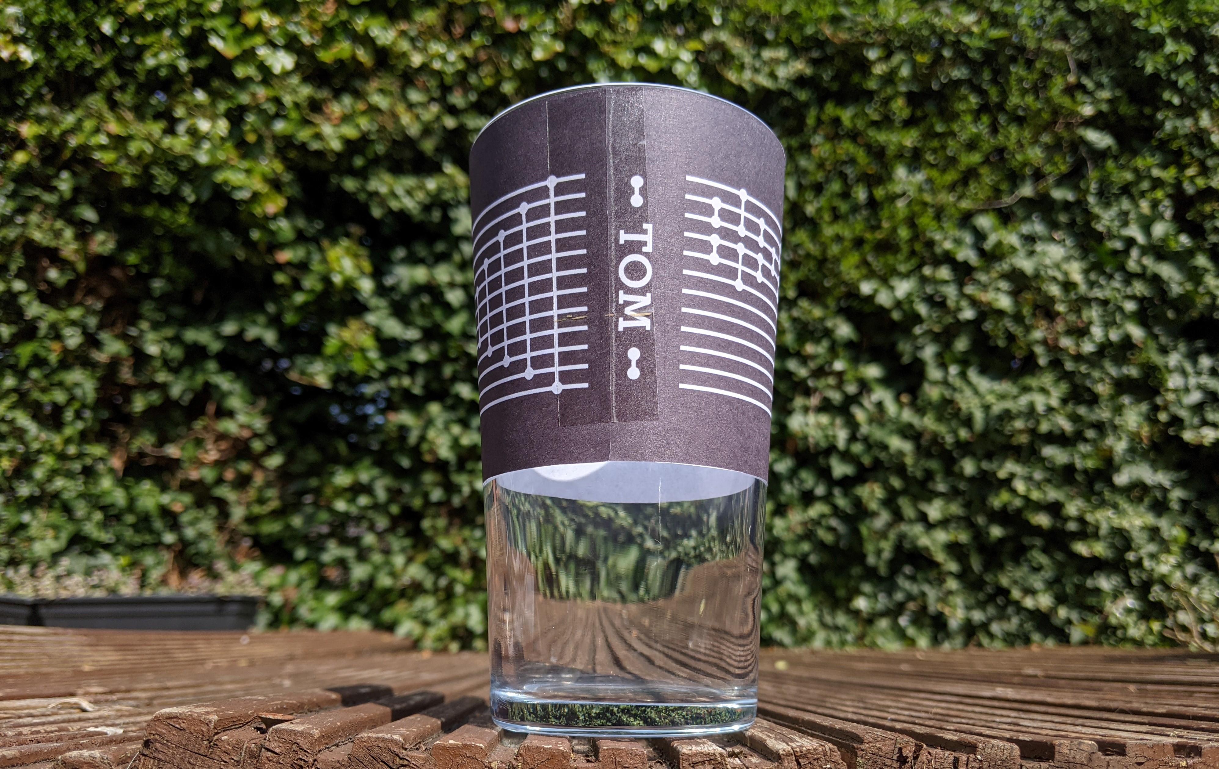
This already gives the basic design of a (partial) transposition shuffle wrapped around the glass, but there are still a few details to get right. Since we are sticking a stencil to the pint glass, we have to allow for a slight misalignment where the ends meet and we can’t have the lines of the transposition shuffle meet. Of course, these shuffles only work when starting at the right point anyway so it also makes sense for the maths as well. The original motivation was to help me keep track of pint glasses round the office, so I should probably put my name on them somewhere. The ideal place to put text is between the two ends of the shuffle where we want to have a bit of space as a buffer for alignment issues, but this is a vertical space and brings its own set of problems. Should the text be rotated or should it simply be written downwards? Unless you use a monospace font, writing TOM downwards produces a vaguely triangular shape since the letters get wider as you go through the word. I didn’t really like any of the monospace fonts I tried so I settled on rotating the text.
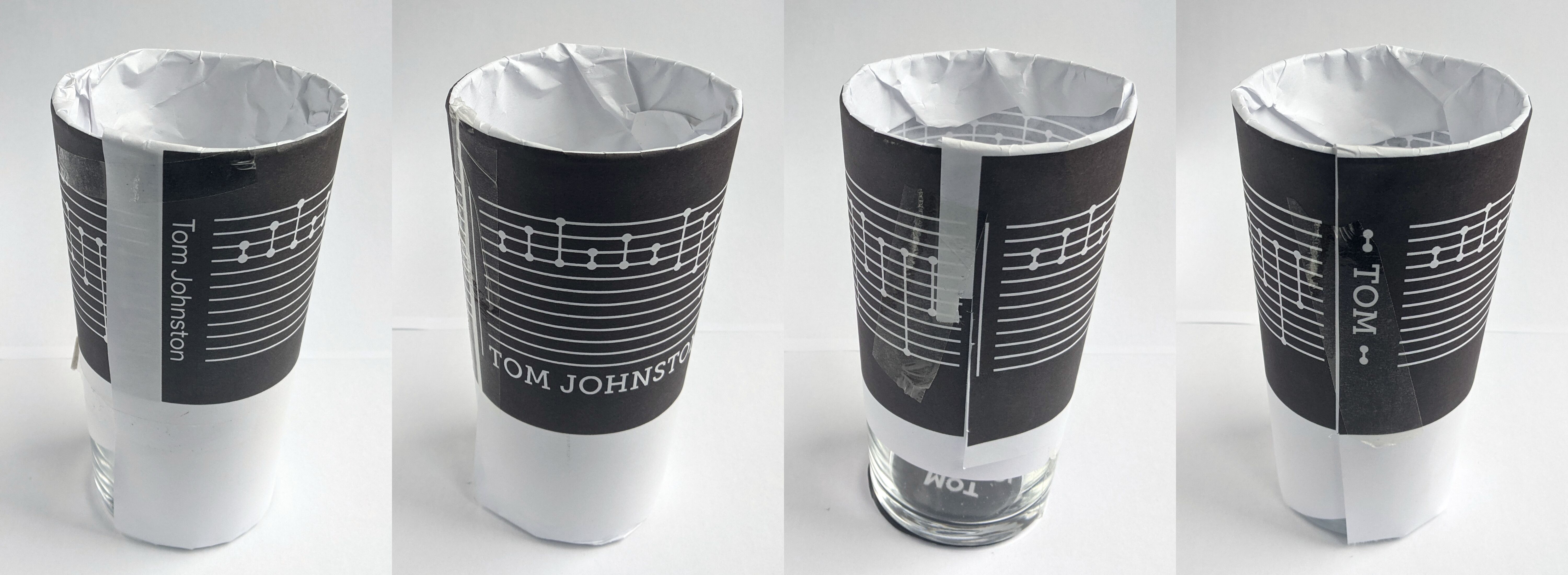
The stencil cutting website also suggested making all the lines at least 1mm thick which forces the text to be quite big, which means that TOM JOHNSTON is too long and TOM is too short. After a bit of experimenting, I added a couple of transpositions either side of the word. Since we want the minimum thickness to be 1mm, we don’t want any font which has any thin lines and the font has to be fairly bold in general. I spent a long time looking at fonts and I won’t bore you with the details since people don’t seem to find this particularly interesting for some reason, but I finally settled on Museo Slab 700. You can see the progression of the different designs in the photos above and the final design in the photo below.

Wrapping the design round the glass
To make the design and etching as easy as possible, we want the pint glasses to be as simple as possible, but a cylinder is maybe going a bit too far and we will use simple conical pint glasses instead. This now presents a small problem with the designs: rectangles don’t wrap nicely round cones. Instead, we need to transform from our rectangular design to the sector of an annulus which forms the surface of our pint glass (ignoring the base).
I’ve written this section last, but it was actually one of the first things I did; it is much easier to test a design when you can see it in the real world. I wasn’t entirely sure what my full design would be and if I would be interested in any other designs (I was tempted by a pint glass with the orbits of the planets/comets on it), so I wrote some (hacky) code to transform from a simple rectangular design round a cylinder to the suitable sector of an annulus to form the frustum. A transposition shuffle is a pretty simple design so I could actually have transformed it to wrap round a pint glass pretty easily by hand and, in practice, the text is probably small enough to not really need any transformation applied to it. You might wonder if the code I wrote was really necessary or if I should have simply made my design in the suitable shape already to which I say: hindsight is 20-20.
Choosing the mapping
We can easily parameterise the surface of the cone as \((z, \theta) \) where \(z\) is the height up the cone and \(\theta \in [0, 2 \pi)\) is how far round the cone we are. It is then easy to unwrap the cone to a flat sheet where the point \((z, \theta)\) is mapped to \(((z + h) \cos(\alpha\theta), (z+h) \sin(\alpha \theta))\) for some constants \(h\) and \(\alpha\) that depend on the dimensions of the cone. The difficulty is then determining how we want our rectangular design to map to the surface of the cone, and not unwrapping the cone afterwards.
If our cone is very tall, we might expect the cone to locally behave much like a cylinder. Unwrapping the surface of a cylinder of height \(h\) and radius \(r\) gives a rectangle of height \(h\) and width \(2 \pi r\), so we can easily wrap a rectangular design round a cylinder simply by viewing the \(y\) and \(x\) as \(z\) and \(\theta\) (up to rescaling). Since we are only interested in a small variation in height, a cylinder isn’t actually a terrible approximation. We will place a cylinder which intersects the cone roughly in the middle of the height we are interested in, make a rectangular design for the surface of the cylinder (which is a rectangle) and then map the \(y\) and \(x\) to \(z\) and \(\theta\) as if the cone was a cylinder. If we draw a horizontal line from the central axis of the cone to a point on the cylinder, we are equating that point on the cone with the intersection of the line with the cylinder.

This choice isn’t without fault. Consider a vertical rectangle. In our mapping, the angle the rectangle subtends (or range of \(\theta\)) is constant. On the cylinder, this makes the rectangle a constant thickness, but on the cone the rectangle is wider at the top than the bottom. The same applies to circles, the other main component in our design; circles are stretched differently at the top of the cone and the bottom of the cone. Since our design is fairly short compared to the angle of the cone, this doesn’t make a huge difference, but there is another option. What if we view the lines in the transpositions shuffle as lines with no thickness and the circles as points? We can then map these points and lines to the cone by viewing the cone as a cylinder and the approximation behaves nicely. Once we have unwrapped the cone, we can replace the lines with rectangles of a given thickness and the points with circles. The circles are then circles on the surface of the cone in the sense that the length of a geodesic from the central point to a point on the circle is constant. You can see the difference between the two options above. I settled on the second option for the circles and lines, but the text is more complicated and is mapped as solid shapes.
There are other options for mapping a design onto the cone. One option one of my housemates is keen to try is to use a conformal mapping from the rectangle to the cone. If your design is small, it might be interesting to fix a point to view the glass from and map the design so that is lines up perfectly from that single view point. The design will be distorted when looked at from other points, but that might be part of the charm of the glass.
Implementing the mapping
The above might tell you what I did, but it doesn’t really tell you how I did it. I’m a big fan of using SVGs: your images look crisp at all resolutions, they produce relatively small files (for simple designs), they are somewhat easy to manipulate with code or by hand and they are defined by a series of mathematical objects which appeals to my perfectionist side. SVGs are also packed with many other useful features too numerous to name here. However, all these features come at a cost, and it cannot be easy to write something which correctly renders every SVG. I decided to make the rectangular design as an SVG, parse it using some code and output the SVG suitably distorted to wrap round a cone. This is where all those features start causing problems. We only care about where something needs to be displayed and we aren’t interested in groups for example and the potentially nested group transformations. We also want everything to be in some kind of form which is easy to manipulate i.e. paths made up entirely of cubic Bézier curves in absolute coordinates. With the exception of arc segments, it is easy to convert any segment to a cubic Bézier curve, so we will settle for removing groups and arc segments. Fortunately, we control the input so we can remove these problematic parts before we input the SVG into the program, and our simple designs haven’t used any of the other features. However, it does mean the code is very brittle and I’m not going to be releasing it anywhere.
Let’s suppose we have a cubic Bézier curve where the coordinates are currently \((z, \theta)\) and we’ve already scaled \(z\) and \(\theta\) appropriately. Our goal is to convert it to a cubic Bézier curve in the coordinates \((z \cos(\theta), z \sin(\theta))\), but how? A cubic Bézier is the path \(x(t), y(t)\) where \(t \in [0,1]\) and \(x(t)\) and \(y(t)\) are cubic polynomials. By changing the start point, the end point and the control points of the cubic Bézier curve, we can make these polynomials any cubic polynomial we want. If we are starting with the polynomial curve \((z(t), \theta(t))\), the curve we would ideally like is given by \((z(t) \cos(\theta(t)), z(t) \sin(\theta(t)))\) which isn’t a polynomial, but we can try approximating it by a cubic polynomial. Since we are going to be distorting a sequence of cubic Bézier curves where the start of one cubic is the end of the previous one, it seems sensible to keep the end points fixed. This immediately suggests using some kind of polynomial interpolation and, having taken the excellent Approximation of Functions course by Nick Trefethen, I went for interpolation in Chebyshev points of the second kind. This gives us the points \(\{0, 0.25, 0.75, 1\}\) and it is not hard to work out a simple formula for the control points based on the value of the function at these points. Let \((x_t, y_t)\) (where \(t \in [0,1]\)) be the curve which we want to approximate. This method approximates it by the cubic Bézier starting at \((x_0, y_0)\) ending at \((x_1, y_1)\) and with control points \[ \begin{aligned} X_1 &= -10/9 x_0 + 8/3x_{0.25} + -8/9x_{0.75} + x_1/3\\ Y_1 &= -10/9 y_0 + 8/3y_{0.25} + -8/9y_{0.75} + y_1/3\\ X_2 &= x_0/3 - 8/9 x_{0.25} + 8/3 x_{0.75} + -10/9x_1\\ Y_2 &= y_0/3 - 8/9 y_{0.25} + 8/3 y_{0.75} + -10/9y_1\\ \end{aligned} \]
The output
The designs we have seen so far have shown the design we want to etch in black with a transparent background. Since we want this to be where the etching cream contacts the glass, we are going to invert the design and swap the transparent and black parts. It was a little difficult to measure the glasses perfectly accurately and I didn’t want to leave a gap between the two ends of the stencil when it was wrapped round the pint glass so I built in a couple of mm of overlap. This leaves us with the following final designs.

